Concord Community Church
Branding
Through my work with Gateway, I was connected to Concord, who needed a new identity and brand system focused on their connection to the community.
I started working with Concord due to a connection with a previous pastor and was immediately drawn in by the energy that the church brought, one really focused on community and relationships with others. Many churches put “Community” into their name, but I felt that it was truly a core part of the Concord brand.
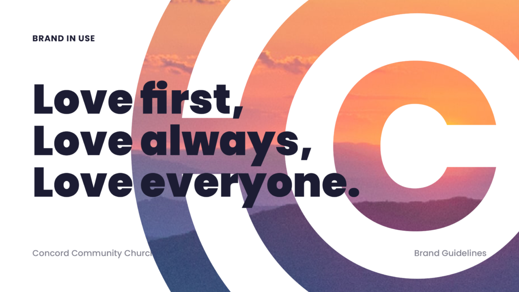
The passages and images below are pulled from the finalized brand book that I created for Concord, and I think they provide a great look into the full package that branding encompasses.
–
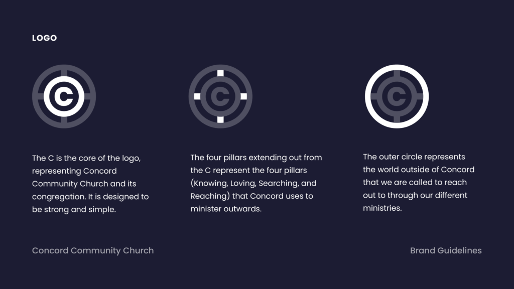
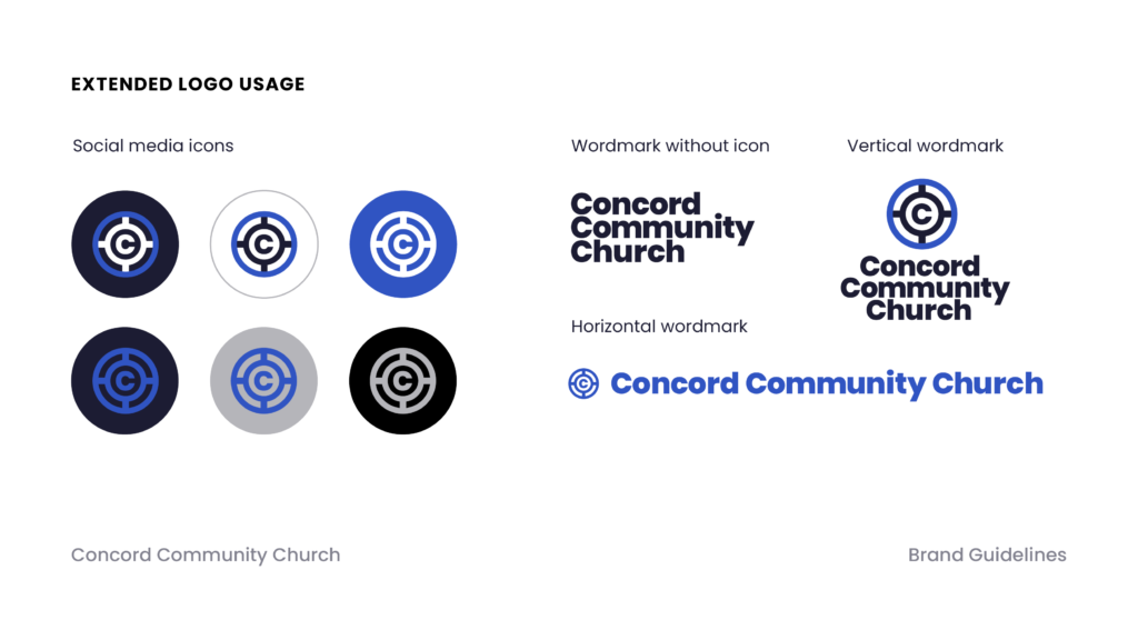
Concord’s new logo is designed for the best kind of simplicity – one that allows for flexibility in usage but still maintains a look that is recognizable. The icon can stand on its own in instances like social media usage, apparel usage, or any other usage where space is at a premium.
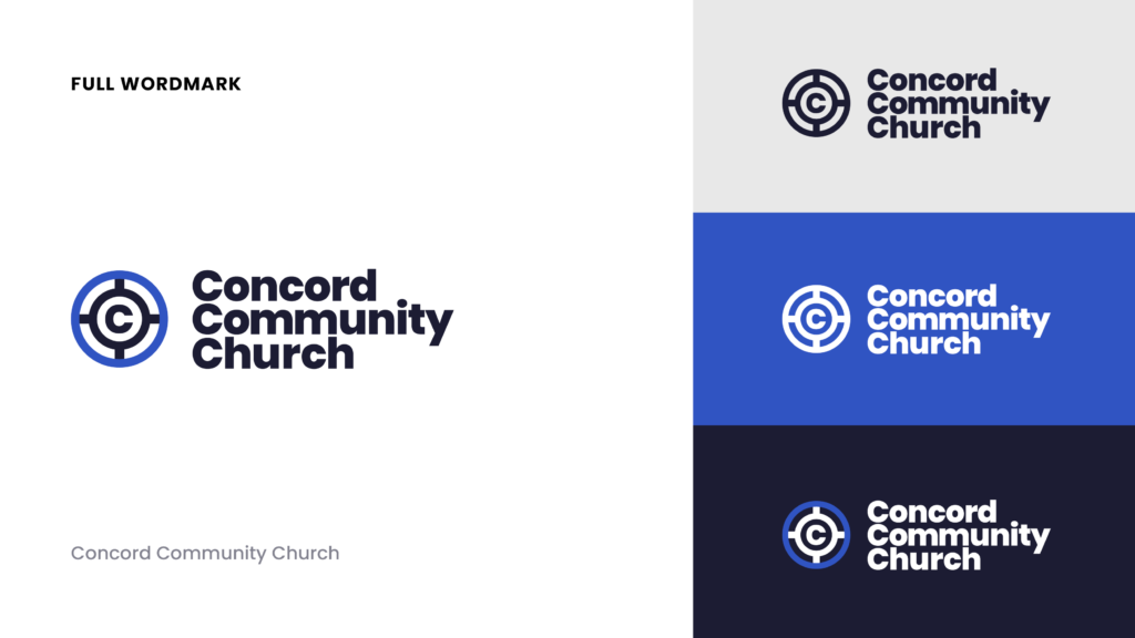
The full wordmark can be used in all other contexts, where the name of Concord is important to highlight. Neither of these options is better or worse – just different options for different use cases.
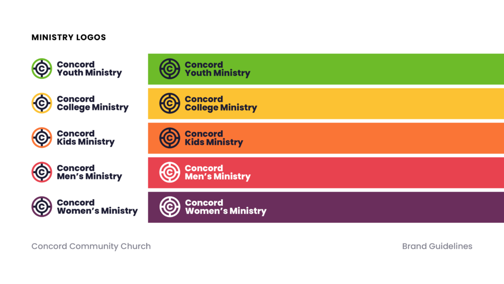
The ministry-specific logos are designed to be identical to one another, save for the name and the color. This allows each ministry to have a distinct personality but a consistent identity under the larger brand.
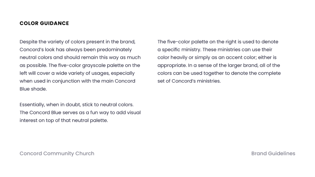
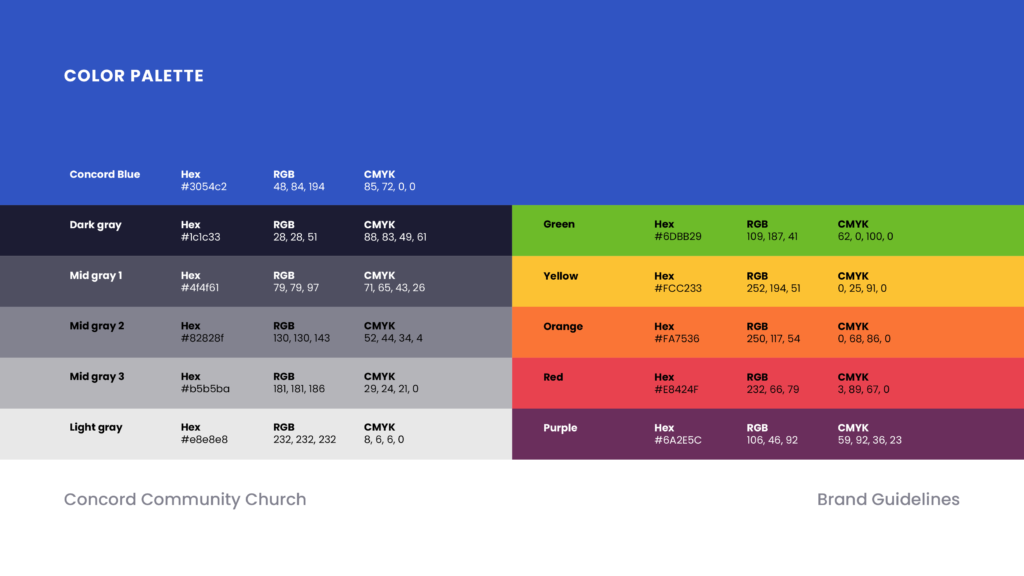
Despite the variety of colors present in the brand, Concord’s look has always been predominately neutral colors and should remain this way as much as possible. The five-color grayscale palette on the left will cover a wide variety of usages, especially when used in conjunction with the main Concord Blue shade.
Essentially, when in doubt, stick to neutral colors. The Concord Blue serves as a fun way to add visual interest on top of that neutral palette.
The five-color palette on the right is used to denote a specific ministry. These ministries can use their color heavily or simply as an accent color; either is appropriate. In a sense of the larger brand, all of the colors can be used together to denote the complete set of Concord’s ministries.
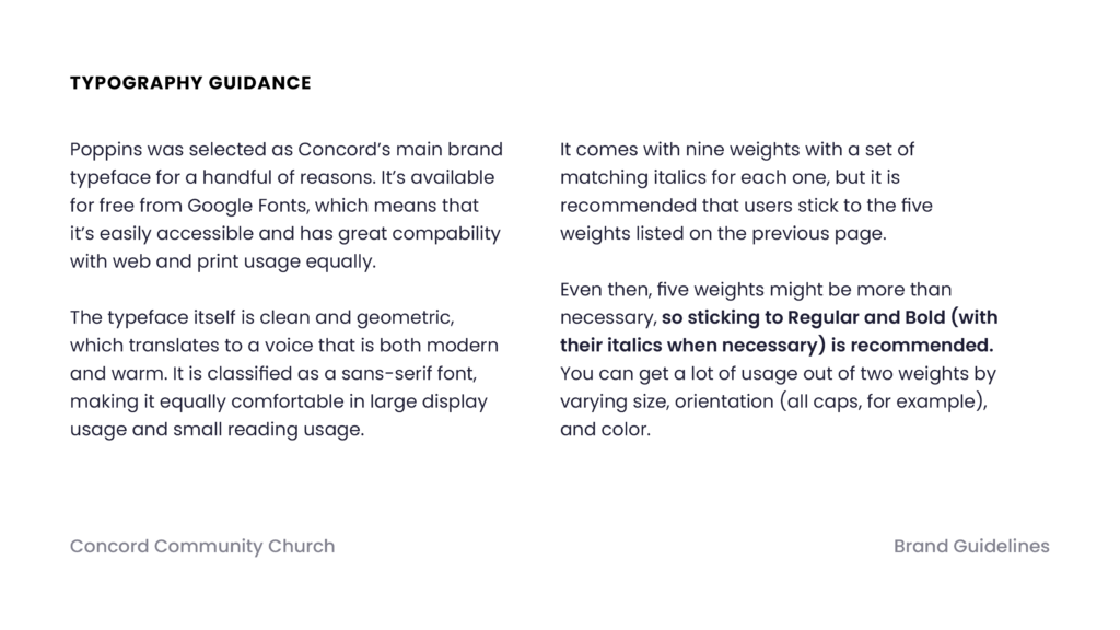
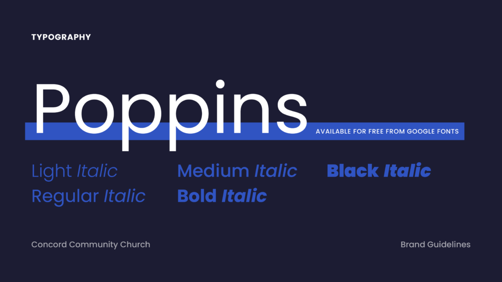
Poppins was selected as Concord’s main brand typeface for a handful of reasons. It’s available for free from Google Fonts, which means that it’s easily accessible and has great compability with web and print usage equally.
The typeface itself is clean and geometric, which translates to a voice that is both modern and warm. It is classified as a sans-serif font, making it equally comfortable in large display usage and small reading usage.
It comes with nine weights with a set of matching italics for each one, but it is recommended that users stick to the five weights listed on the previous page.
Even then, five weights might be more than necessary, so sticking to Regular and Bold (with their italics when necessary) is recommended. You can get a lot of usage out of two weights by varying size, orientation (all caps, for example), and color.
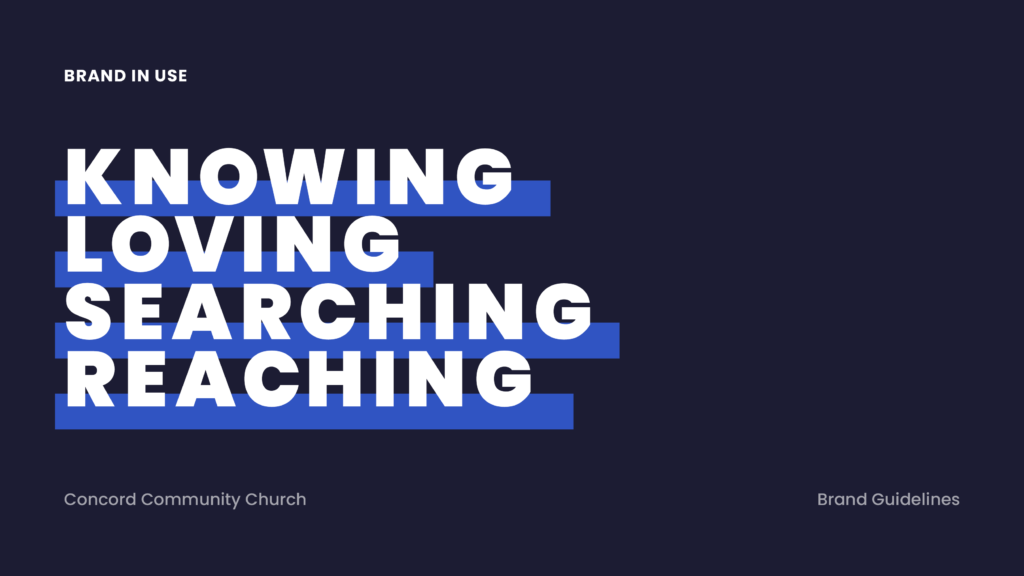
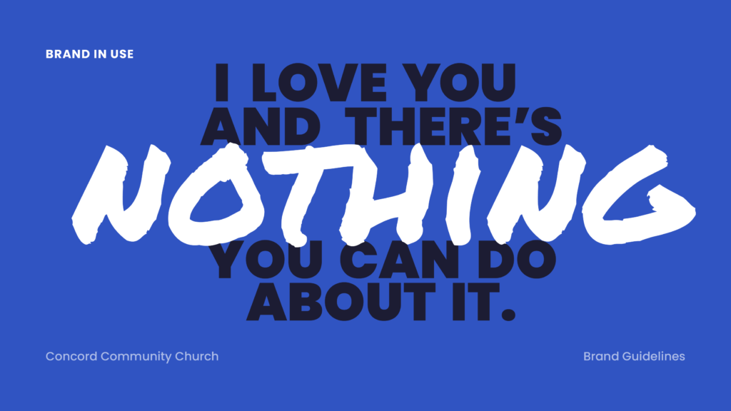
Below, you can find a few examples of all of these elements working together in promotional material. Unfortunately, while the contract was completed and the project was approved, the church has not implemented their new brand package yet. Stay tuned!