A dream project of mine – creating the logo, typographic system, color palette, menu, and more for a local pizza restaurant in Nashville, TN.
Skip to the gallery →
Night Train Pizza came to me in 2017 with a dream project – create the identity for a local pizza joint. To do so, we decided to create a system of logos, typography, and colors that was extremely flexible in order to address the wide variety of needs they had.
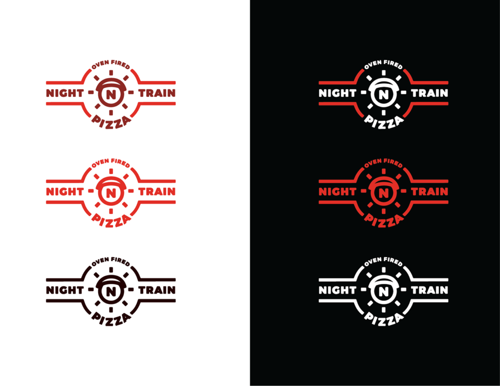
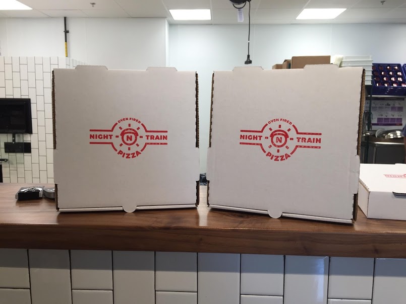
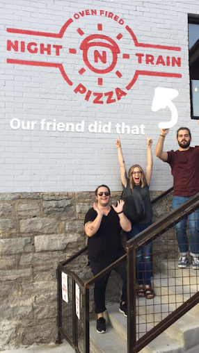
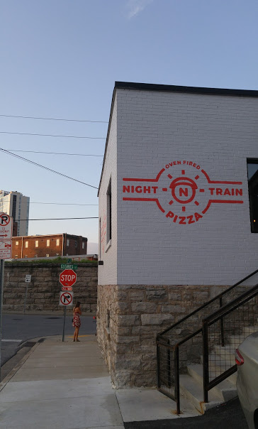
We started with a logo. We wanted something bold and simple, something that would look as good on the side of a building as it would stamped onto a pizza box. We created the surrounding typography for the logo around a simple train headlight icon shape. That icon would serve us well on social media and the backs of t-shirts.
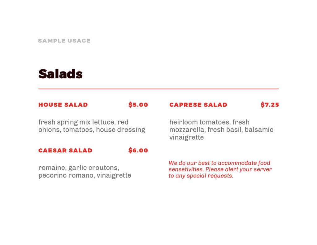
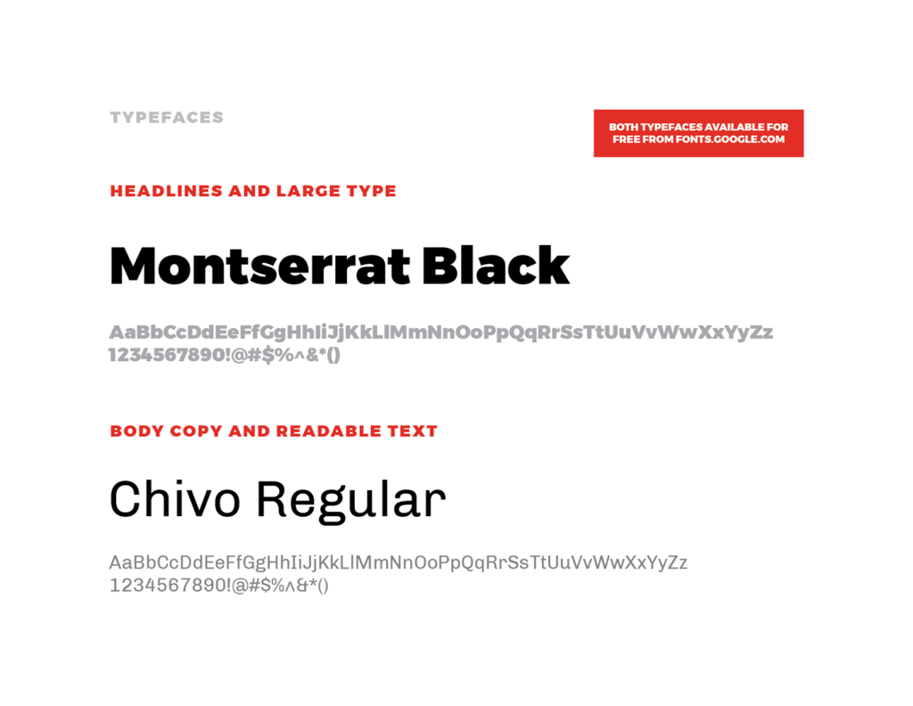
Next, we created a typographic palette. I originally selected Montserrat as the only typeface because of its availability, but after reading Bethany Heck’s piece on multi-typeface systems, I realized that Chivo could accomplish body copy designations better than Montserrat could, so we used them both. They are both simple sans-serifs, but the geometric edges to Chivo make it more readable and unique as body copy text.
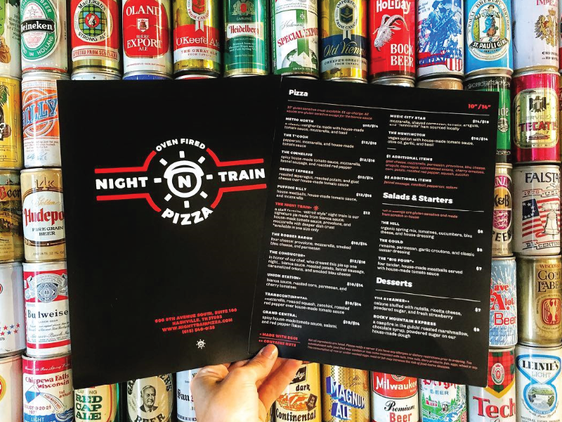
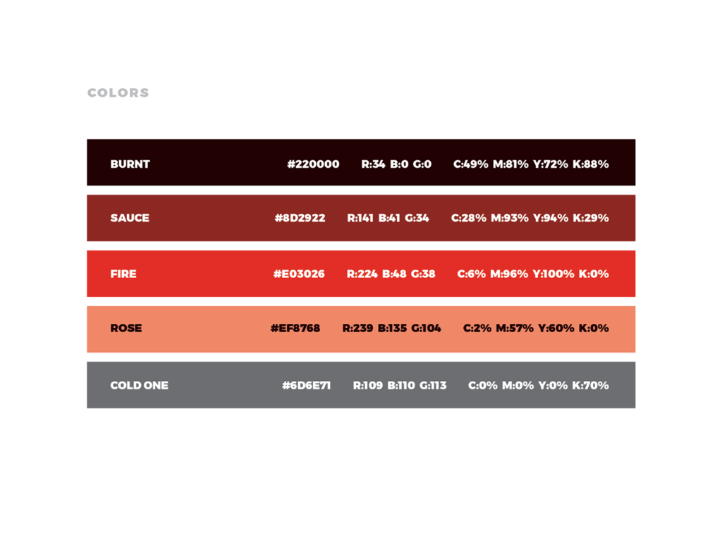
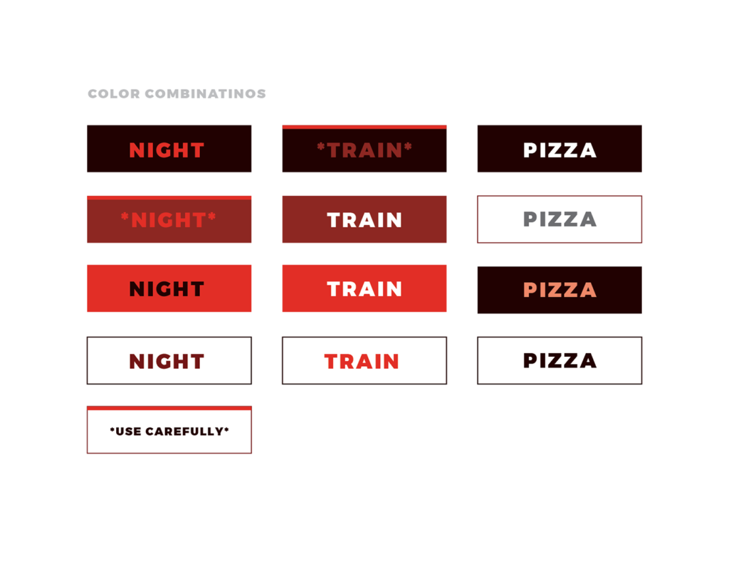
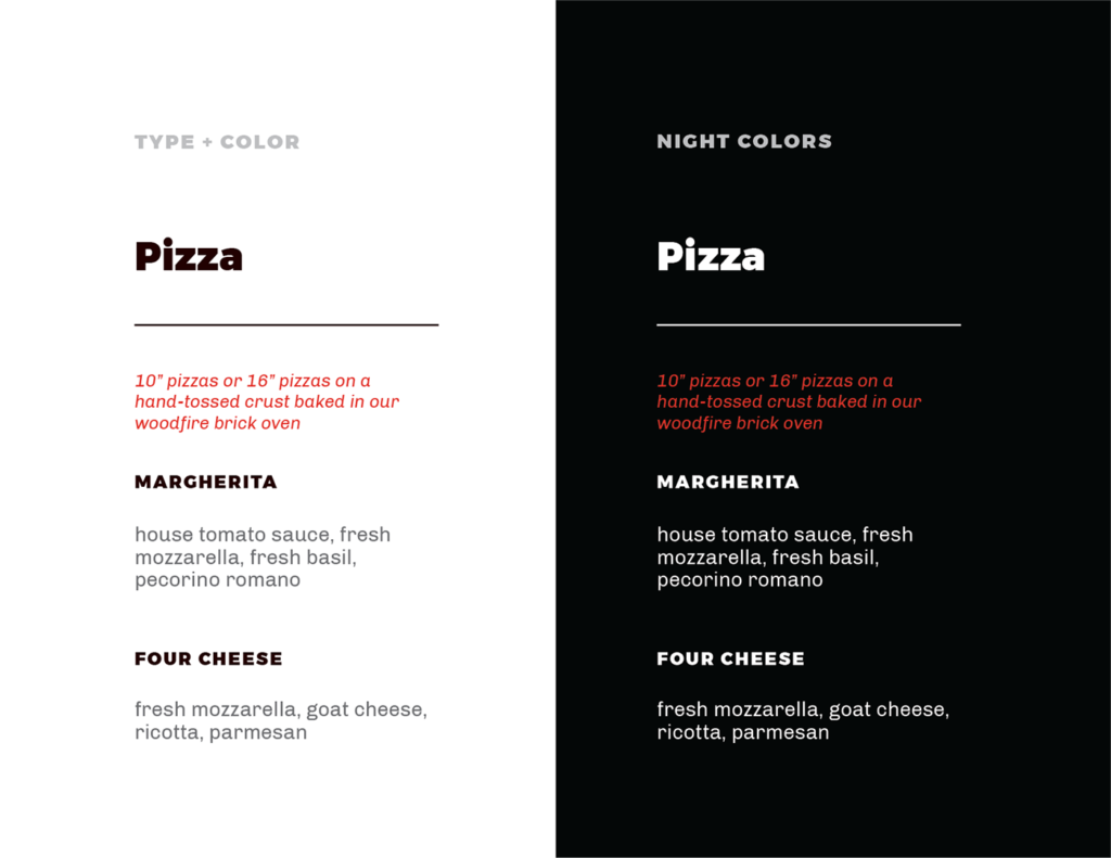
Finally, we created a system of colors, which is really where this brand came to life. By embracing the “night” theme of the restaurant, we focused on dark backgrounds and bold colors that looked like a neon pizza sign on a dark night. We applied this to everything and it became the core of the system – black t-shirts with red logos, and black menus with white and red text.
When Night Train finally opened in August of 2017, I had the incredible experience of being able to sit in a restaurant that I branded and enjoy some great pizza. They had a pizza with street corn on it that was a personal favorite, and they served soft drinks in the transparent red plastic cups that are ubiquitous in local pizza places. This was definitely one of my all-time favorite projects.